Archive for December, 2015

TONAL PAINTING

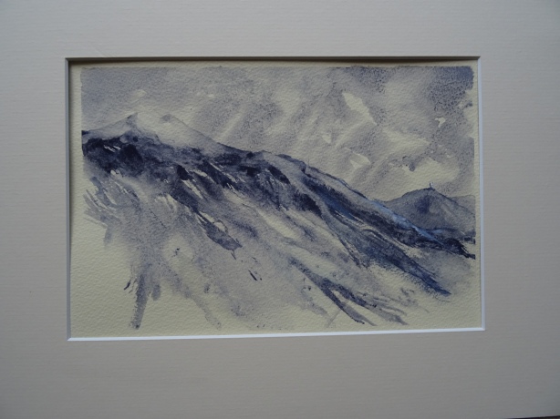
Whenever I teach a course, one of the first lessons, for beginners to Watercolour painting is usually how to paint in just one colour. Also known as tonal painting.

Close up of The Old Windmill & The Islands

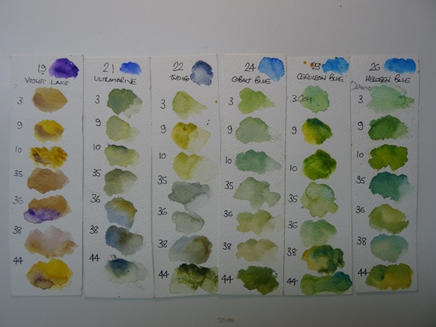
Using just one colour forces you to observe the tonal qualities of a scene. Appreciating it’s tonal values, and how to achieve the resulting  recession gives paintings distance, and avoids flat paintings.

When I teach students from around the World I first get them to ‘really look’ at a scene and to analise how many layers, or ‘planes’ are in the scene. Let me explain…..

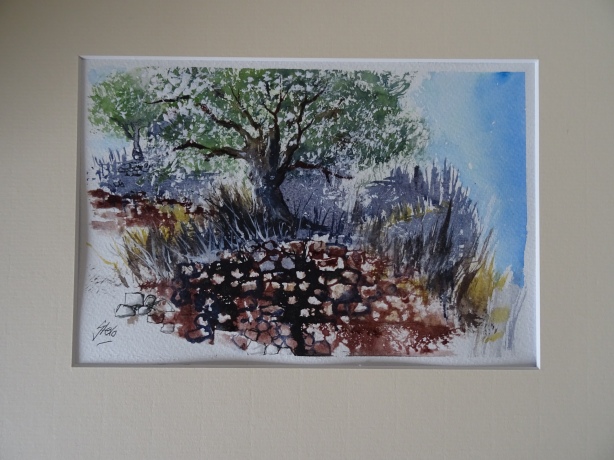
I usually advocate painting watercolour landscapes from light to dark so taking the example of a close up of one of my own paintings called ‘The Windmill and The Islands’ the order I painted it was as follows:-

  1. THE SKY
  2. THE DISTANT HILLS
  3. THE MID DISTANCE ISLAND AND LIGHTHOUSE
  4. THE FOREGROUND WATER
  5. THE WINDMILL

So this scene has FIVE PLANES, EASY !

Although the sky in this painting is quite dark, this is usually the order to paint it, and sometimes a scene can have as many as say 8 planes. What happens is that as you paint the painting the colour gets both darker and also warmer as you move forward into the main point of interest, in this case the windmill.

DSC02478

q. Ah but how do you do that as a beginner ?

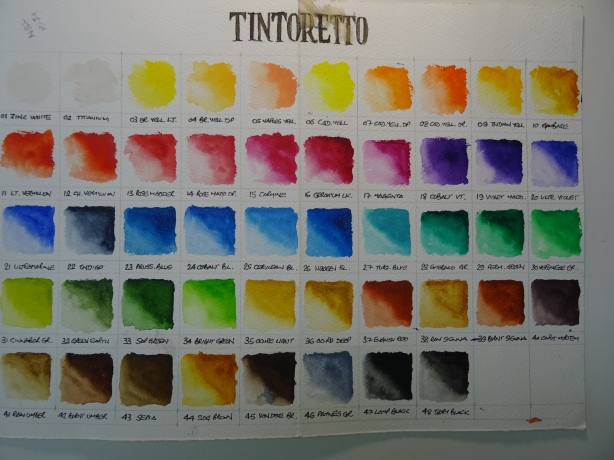
a. Try this little experiment with say a Sepia colour.

Take a palette and put a little Sepia (any colour will work) in each of the wells. Load a brush with one dip of water and mix all of the paint into it thoroughly for the darkest tone (number 5 on the right above) paint it onto your test strip of watercolour paper.

Now add say three brushfulls of water for number 4, then say 6 brushfulls for number 3. Keep increasing the amount of water until you get to the lightest tone, number 1. Now in your palette is your paint ready mixed for your tonal painting.

So now use your paint in well one (the lightest tone) to paint your sky, then move forward in your painting using ever darker colours.

Painting tonally like this is a great way to sketch too, and you only need one tube of paint. It was a technique I used when demonstrating on a night outside a gallery under street lights. It was impossible to paint in colour under the yellow lights, but easy painting tonally.

The resulting paintings also have a harmonious feel too.

The Mountain Demo

SO GO ON GET TONAL !

HAPPY PAINTING !

Martin (aka artstevo)

Please feel free to subscribe or comment on my blog


MAKING YOUR OWN COLOUR CARDS

DSC02476

When I buy a new colour or, as happened recently, I decided to change to a new brand altogether, I always experiment with the new colours and different colour combinations. This enables me to get to know the specific qualities (and also any limitations) of the new colours.

q. So why do you make your own colour cards ?

a. For several reasons

  1. If you get a colour card from an art shop, the reproduction is limited by the printing process, so is usually inaccurate.
  2. If you print one off the internet, it is usually worse.
  3. The colour represented on the casing of the paint is usually miles off.

So for these reasons I make my own.

You simply make a grid for the number of colours using your normal watercolour paper, in my case 48 colours in the full range of Tintoretto paints and 300gsm Bockingford. Then simply dip a moist brush into the tube (or pan) and paint a block of colour gradually make it weaker and then you can see all the various tones of the colour.

DSC02477

ITS VERY IMPORTANT TO ENSURE YOUR BRUSH IS WASHED OUT THOROUGHLY BETWEEN COLOURS OR THEY WILL BE CONTAMINATED WITH THE LAST ONE.

Ok so now you have your colour card what then ?

Let me give you an example, earlier this year I was teaching in Vassiliki in Greece. In Greece the greens are completely different than in my adopted home in Bulgaria. A couple of my favourite trees there were Cypress trees and those very old Olive Groves.

The Old Olive Grove

Both of which are not found in Bulgaria. So my solution was to combine lots of combinations of some of my blues and yellows, and record the results on offcuts of watercolour paper. It was then very easy to hold the sample up against the subject and pick the combination required.

DSC02479

These were the different green swatches I made

I also used this same method when I was experimenting with colours for the stunning sunsets in Greece, combining reds, oranges and yellows.DSC02475

I use these extensively, and to great effect during my workshops in Greece, Bulgaria and Asia.

Why not try making your own, different sky combinations would be a good one wherever you live in the World. In the UK the skies generally are colder so are usually Ultramarine based, whereas in warmer climates Cobalt or even Cerrulean Blue are more accurate.

HAVE FUN WITH COLOUR !

More tips to come, please feel free to subscribe to my blog or leave any comments.

HAPPY PAINTING !

Martin (aka artstevo)